15 Must Have Fonts for Every Graphic Designer
- Admin
- November 30, 2016
- 2,168
Fonts are one of the most important tools for every graphic designer. Classic collections as well as modern fonts are both essential for designers who need to deal with diverse projects on a regular basis. There are tons of fonts out there which makes it very challenging to actually grab the best ones.
I have come up with this list of the top 15 fonts that will prove to be useful for all kinds of projects.
Read also:15 Best Websites to Download Stock Photos
1. Gotham
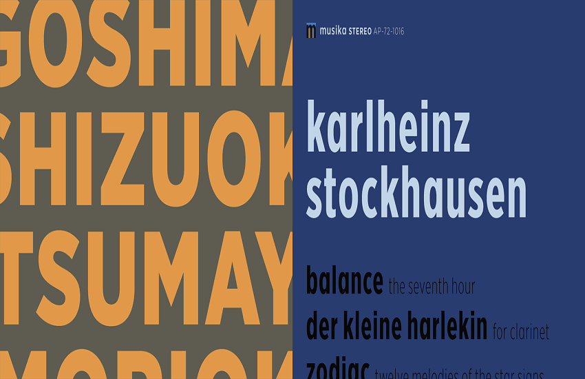
Inspired by New York's architectural signage of the mid-twentieth century, this font was initially commissioned by GQ magazine. From Obama’s presidential campains to One World Table, it has been used everywhere. The font is available in four widths.
2. F37 Bella
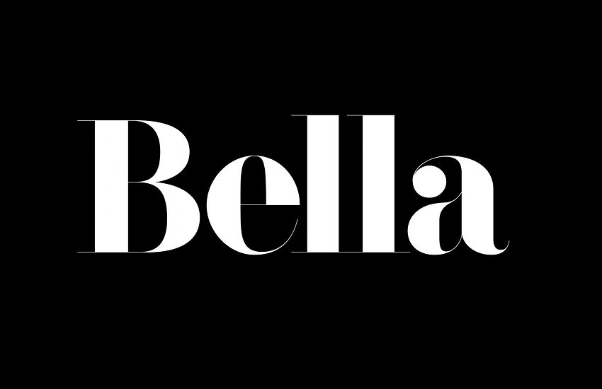
A classical Didot-inspired beauty, this is a must have font for any designer who believes in quality. It is an award-winning display font by Rick Banks. It has a classical French Didot style and at the same time it features a contemporary geometrical twist. The font has alternatives and covers an extensive range of Latin-based languages.
3. Hermes
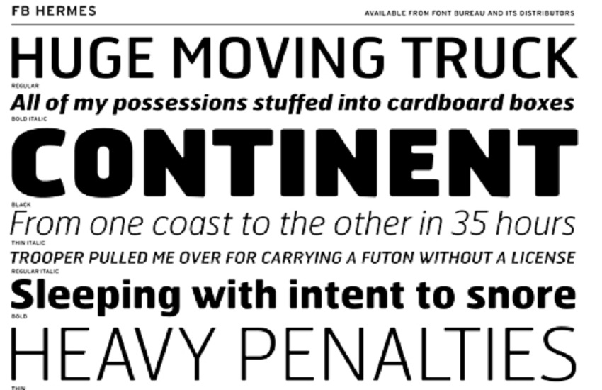
One of the hot favorite of most designers around the world, these fonts for Graphic Designer are available in a large range of weights and styles. Back in 1995, Font Bureau's Matthew Butterick updated an original German design from 1908 ensuring the blunt corners that once indicated wear and tear from the hefty industrial presses, but are now a unique characteristic of the modern Hermes typeface as we have got to know it.
4. Otto
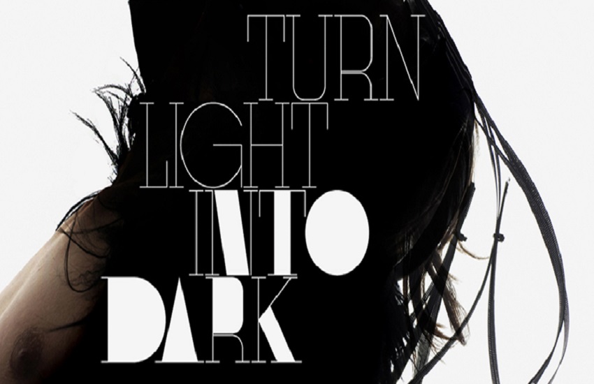
A Non-Format's first commercially available font, this is an amazing font talented design duo Non-Format. Otto features a combination of delicate lines and flashes of block color. All in all, it is an extraordinary display font with couple of personalities which are ideal for large formats.
5. Cumulus & Foam
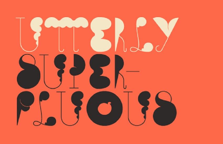
This surreal display font features simple, ultra-thin lines with bulbous, cloud-like forms which makes it one of its kind. It was designed by Stefan Kjartansson for YouWorkForThem. Although Kjartansson asserts that it doesn't work as a typeface, Cumulus & Foam’s "disciplined chaos" can add character to your work for sure.
6. Linotype Didot
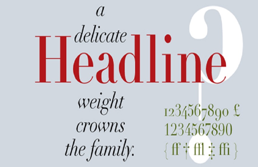
If you wish to add a classic, timeless elegance to your work this font can be the best way to do it. It was developed in the late 18th century. The font is characteristic sharp, seductive serifs and has harsh angles. You can say it appears to be a slimmer version of Bodoni.
7. Eames Black Stencil
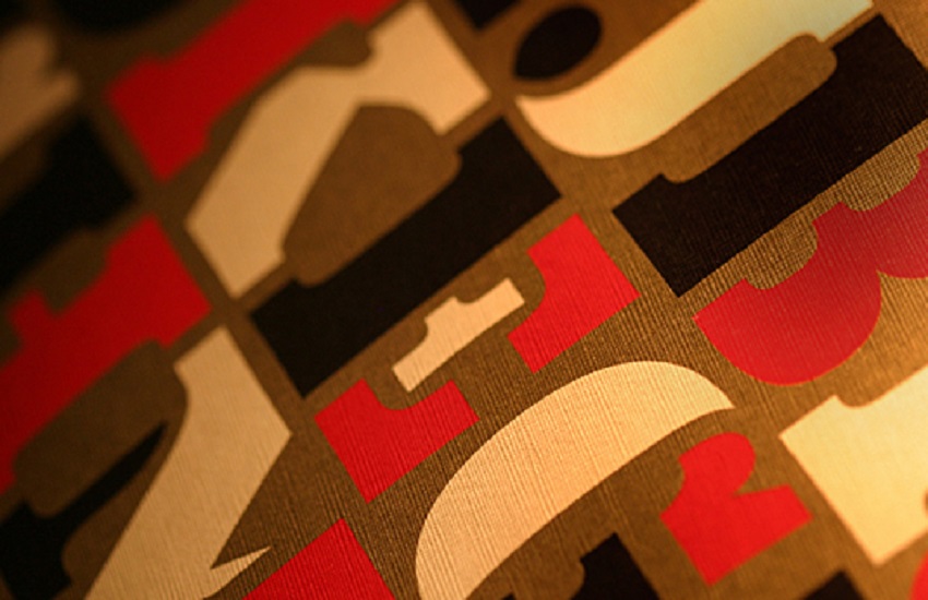
This is one of the best fonts for Graphic Designer and those who are looking for a great stencil font. Eames Black Stencil is beautifully designed and not gimmicky at all. Coming from the broader Eames family, the curves in the font were inspired by the curvature of bent plywood.
8. Bembo
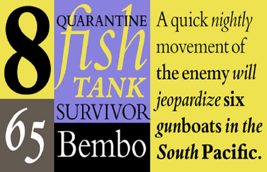
This font was reborn under the Monotype label in 1929. Bembo is a 20th century restoration of an old-style serif initially cut by Francesco Griffo in the late 15th century. It is generally considered a great typeface for setting book copy. You can use it for expressing traditional, formal beauty.
9. Rooney
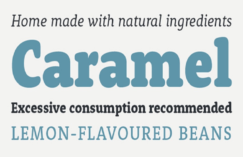
These fonts for Graphic Designer have quite a friendly feel – it is never too cheerful or cheap. Rooney basically makes one of a growing number of modern fonts assigned as predominantly effective for use on screen. It is particularly great for apps and websites. Its subtle rounded serifs and terminals help to add personality and impact when used large. On the other hand, it has a softening effect when set in smaller sizes.
10. AG Book Rounded
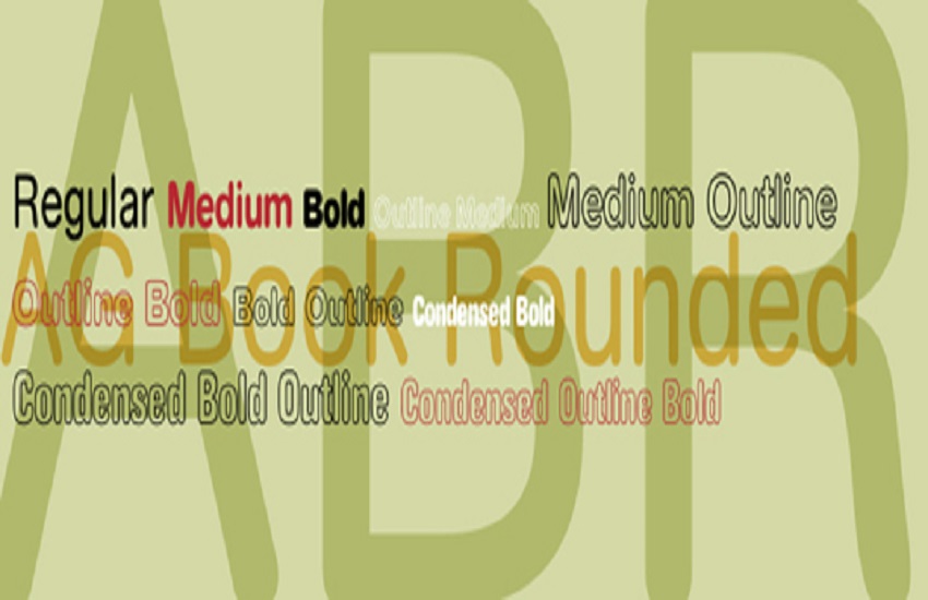
This font has an informal and soft feel. While based on the root typeface Akzidenz-Grotesk, this rounded version from Berthold has a considerably generous spacing and large x-height. It is very suitable for easy reading in children's books as well as advertising.
11. Modern No 20
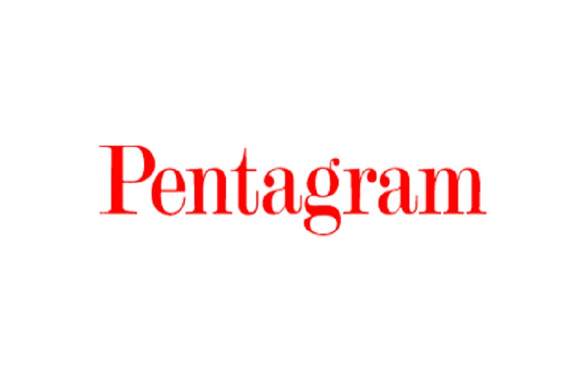
Those of you who crave for class in the work must explore Modern No 20. Designed by Stephenson Blake, it is a modern serif which is an outstanding typographical shorthand for quality and fine-tuning. Modern No 20 is ideal for adding class to titles the world over.
12. Sentinel
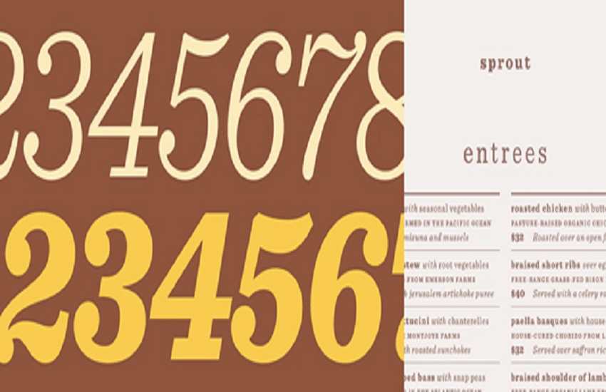
One of the first and most defining types of a slab serif typeface, this font was released in 1845. It overcomes many of the shortcomings of a traditional slab as it integrates a broad range of weights, and well-designed italics. Sentinel ensures real versatility without compromising on style. Remember that this font was used in President Obama's 2012 campaign. messaging.
13. Wagner Grotesk
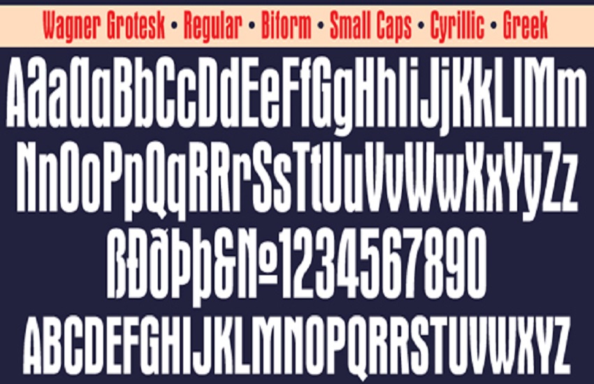
If you are looking for a perfect screen fonts for Graphic Designer, consider Wagner Grotesk. Canada Type's original aim with this broad redesign of Edel Gothic/Grotesque was to enhance and adjust the early 20th century typeface for use on digital platforms. In addition to screen use, it is also great for posters and in headlines as well.
14. Rockwell
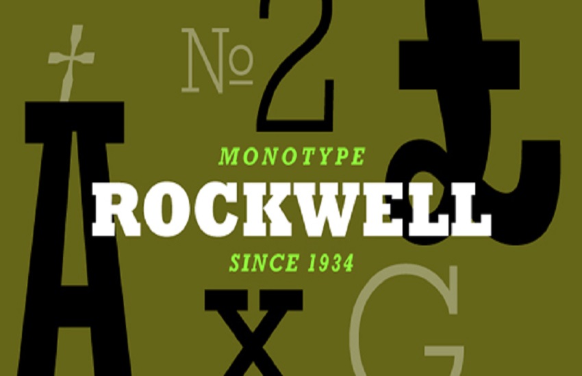
This font is one of the most popular examples of the slab serif genre. It features what strong, thick, edgy serifs, bold shapes and opposing curves can do to add impact to a typeface. It is highly beneficial in capitals for a statement headline piece.
15. Black Slabbath
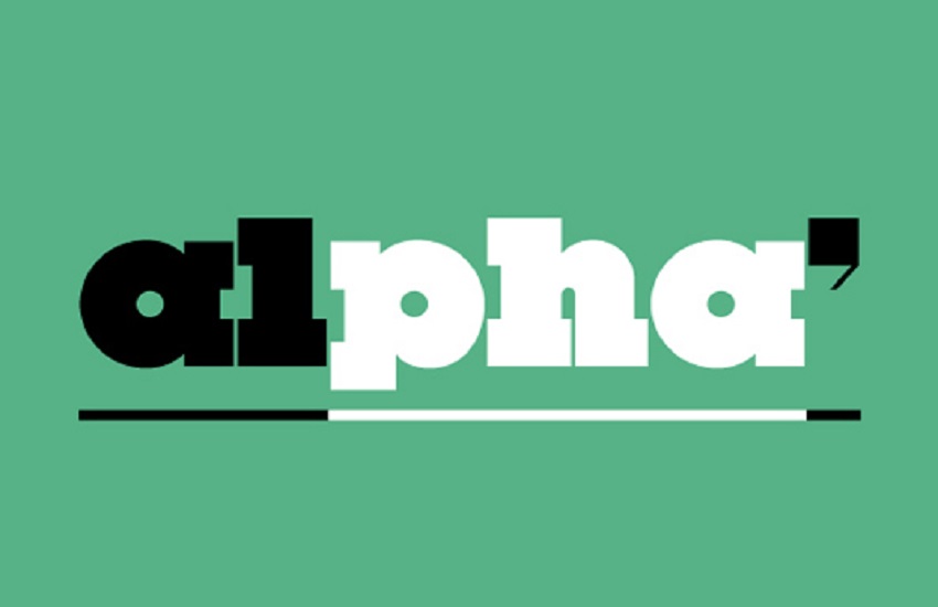
This one is great fonts for Graphic Designer if you use it big. Other than Cumulus & Foam, this is Stefan Kjartansson's other major work. It is headline-stealing "heaviest typeface in the world" having slivers of white space in between ultra-chunky geometric letterforms. Black Slabbath is fine at any size below giant. Use it to roar.

