Twitter revamps its look
- Admin
- October 21, 2017
- 734
Twitter is revamping its look. It has just announced a new interface which is being released to Android, iOS as well as web users of Twitter at the moment. The official blog of the social media site reads:
With lots of feedback and ideas from you, we’re refreshing our product too and making it feel lighter, faster, and easier to use. We listened closely and kept what you love. And for the things you didn’t, we took a new approach to fix and make better.
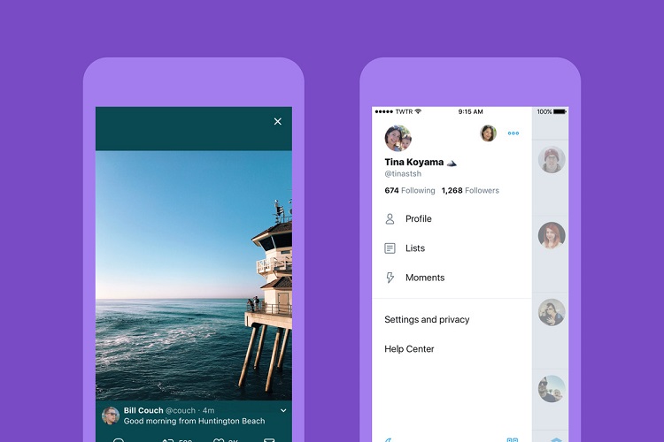
The update streamlines the timeline of the social media site, changing square profile pictures into circles and removing the toolbar on the bottom to just 4 icons. At the same time, the profile tabs have been transferred to a sidebar now. You can access that in a style "hamburger" menu now.
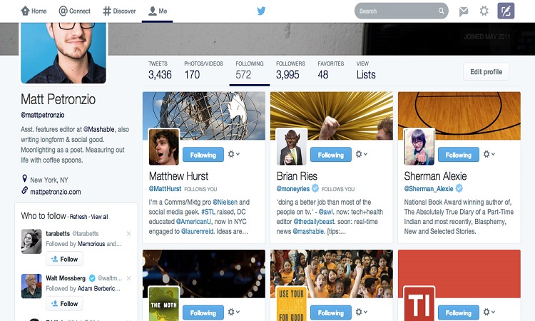
Interestingly the new of Twitter bears a lot similar to Instagram's black-and-white update from 2016, which left out a part of Twitter's trademark blue-and-white design for a more monochromatic and icon-centric touch.
Read Also: Top YouTube Tips and Tricks
Moreover, the update also revamps the appearance of interaction buttons on tweets. That include even changing the 'reply' arrow for a speech bubble. The reason for this change is that some new users earlier on confused the arrow for a backspace or delete function, according to Twitter.
With the update the 'like', 'reply', and 'retweet' counts of each post in real time for mobile apps have also been changed. They enable you to watch those numbers climb increase in front of you when you will tweet out a real zinger next time.
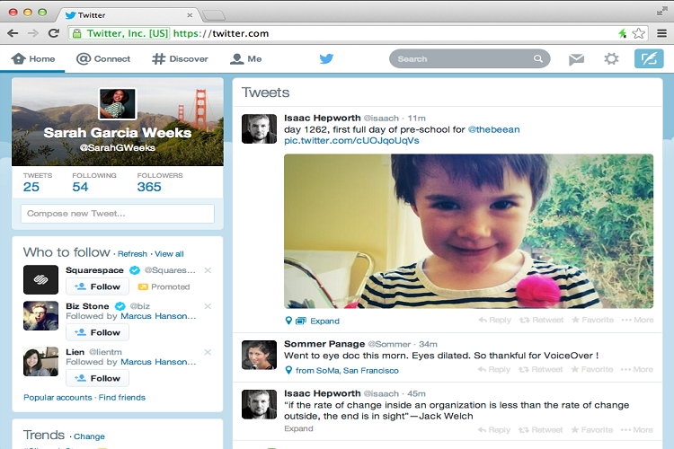
The official blog post of Twitter reads:
Here’s what you’ll see:
• Profile, additional accounts, settings, and privacy – all in one place! A new side navigation menu and fewer tabs at the bottom of our app = less clutter and easier browsing. You told us you loved this change on Android last year and we’re excited to now bring it to iOS.
• Links to articles and websites now open in Safari’s viewer in the Twitter app so you can easily access accounts on websites you’re already signed into.*
• We’ve refined our typography to make it more consistent, and added bolder headlines to make it easier to focus on what’s happening. Also, rounded profile photos make it clearer to see what’s being said and who’s saying it.
• More intuitive icons make it easier to engage with Tweets – especially if you’re coming to Twitter for the first time. For example, people thought the reply icon, an arrow, meant delete or go back to a previous page. We switched to a speech bubble, a symbol most know and love. We also made the icons lighter for more seamless interaction.
• Tweets now update instantly with reply, Retweet, and like counts so you can see conversations as they’re happening – live.**
Some users appreciate the new rounded profile icons of Twitter, there are others who are just not pleased by the new look. According to Nypost.com,
Twitter users immediately responded Thursday by tweeting jokes and memes critical of the changes. There were almost 30,000 tweets about the new user interface, or UI, within hours of the change, the vast majority of them either complaining about the new look or mocking it. A popular image was a suddenly round SpongeBob SquarePants.
According to Twitter's Dan Jackson, Twitter decided to make the changes on the basis of research as well as direct feedback from users. Twitter is still in the process of exploring new ways to make things better for its users, Jackson noted.
The redesign is Twitter’s latest attempt to freshen the messaging service, which has struggled to attract new users at the same pace as Instagram, Facebook and Snapchat. Twitter revenue growth has stalled for years, and the company has cut costs and shuffled executives while still never posting a quarter of profit (Nypost.com)
